1. Describe the craftsmanship of your drawing. (Is it neat and well executed?)
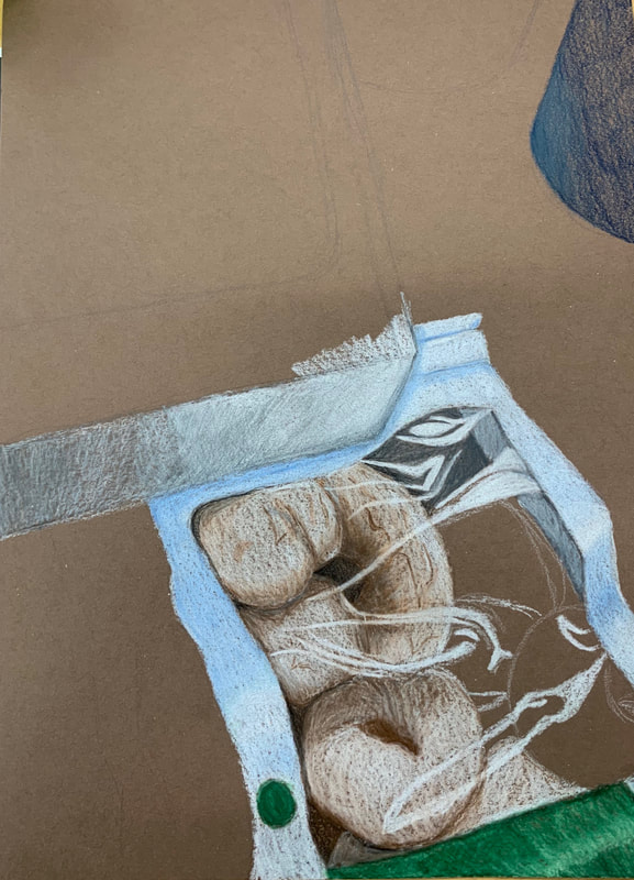
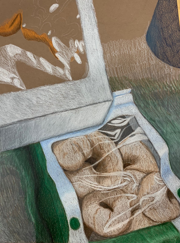
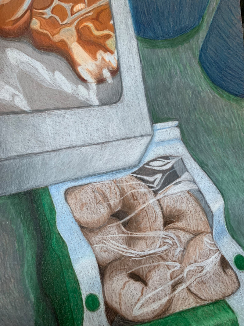
I believe the craftsmanship of my drawing is fairly decent. I feel comfortable with the execution of my idea. 2. Skip 3. Describe your choice of colors/color harmonies and how you used them throughout the artwork. I used a lot of cooler tones throughout the piece, but for the most part tried to keep the colors accurate to my reference picture. I Used warm tones in the pastries to show the bread under the icing/powdered sugar. 4. How did you create contrast in your drawing? I kept the background darker to make the pastry box draw the eye more. 5. How did you use textures, highlights and shadows to enhance your artwork? I used highlights to show the clear plastic parts of the bag and the pastry box. I think my highlights on the box are a little muddled but I am very happy with how the highlights on the bag turned out. I also used shadows to show depth and how the items were stacked. 6. Why did you choose a particular background color to mount your artwork? I wanted to continue with the cooler tones of the piece, and believed that having the counter white like it was in the photo would make it difficult to differentiate between the counter and the pastry box. 7. Discuss the importance of understanding the media (prisma or pastels) and acquiring the skills necessary to create a successful project. I definitely wouldn’t have been able to make this piece without all of the practice we did with prismacolors. Our lessons and practices with opacity really helped me feel more comfortable and understand where to start on this piece. Understanding how to layer prismas really helped make this piece feel successful. 8. Describe any difficulties you had creating your drawing and what you could do to improve your drawing? I think I still have trouble with keeping my lines light and consistent. It especially shows in wide areas that need to be filled, like the background counter. I am still struggling to think of the colors in my piece in layers so they end up coming out muddy sometimes.
0 Comments
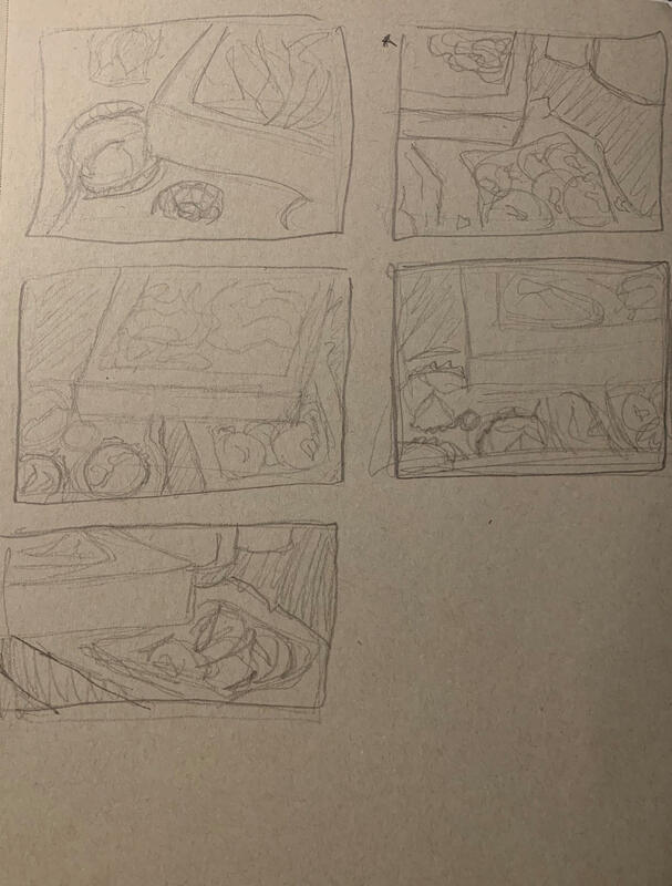
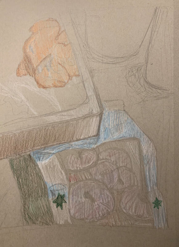
These are the compositional sketches for my Look What You Can See Through project. Originally I was deciding between a composition with wine glasses and a bottle of dish soap, or a composition with a pastry box and a bag of donuts. I tried five different compositions with each idea, then settled on one of my pastry sketches. I then made a larger sketch and started planning out what colors I would be using.
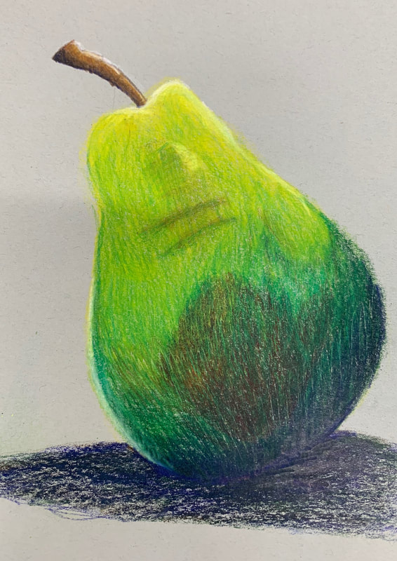
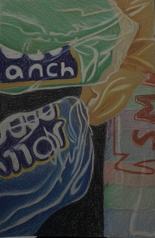 This was one of the drawings we did focusing on elements of opacity. I had never used colored pencils in a serious drawing before this and found them very difficult. It is taking me a long time to get used to how slowly you have to go when layering colors. I am also struggling with the idea of adding colors that aren't seen in the subject at first glance. I do enjoy the colors and the potential colored pencils have, but I think I need more practice before I'll really be comfortable. I do feel like I better understand how to show transparency in my art.
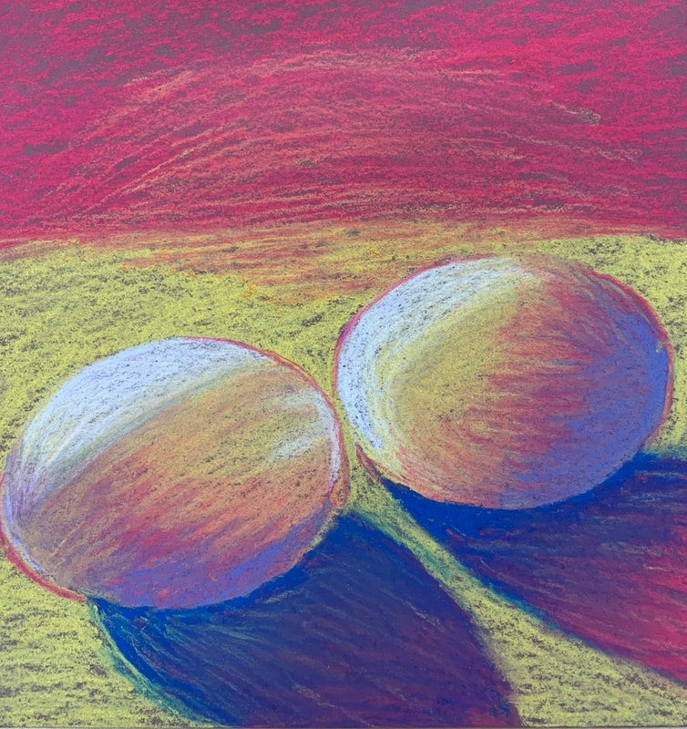
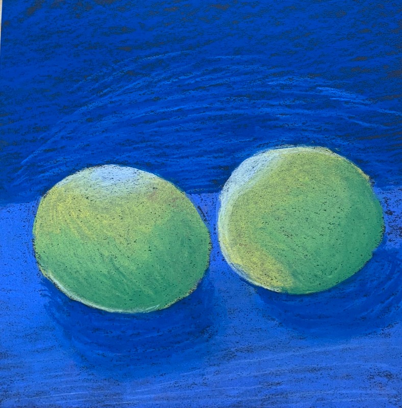
This was my first drawing using chalk pastels. I found them very difficult to get used to, but I loved the vibrancy of the colors. It took a few drawings to get used to the way chalk pastels layer and blend, but I did end up really enjoying them. For these drawings we took pictures of eggs in dramatic lighting and then drew them in chalk pastel on brown and black paper.
 1. Describe how you created an interesting point of view? Was it successful? Why or why not?
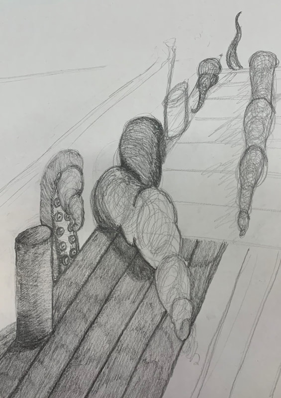
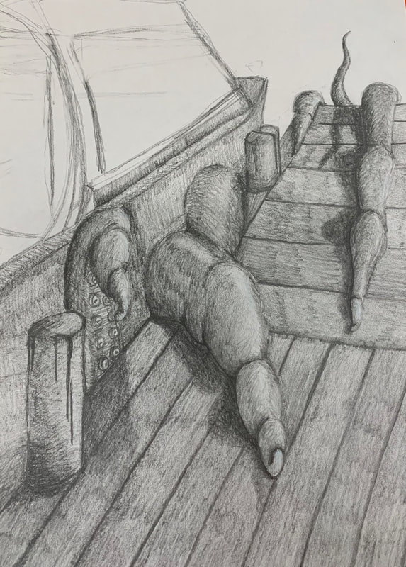
I tried to create an interesting point of view by having the tentacles coming towards the viewer. I think my perspective was interesting, but could’ve been more dramatic. 2. Why is it important to understand perspective and how to draw it? It’s important to understand perspective to keep your work looking interesting and dynamic instead of flat. Art with interesting perspectives is more engaging than art without them. 3. How were the colored pencil exercises important in the success of your piece? I did not use colored pencils. 4. Describe the craftsmanship of your colored pencil. What techniques were used? (How well the project is technically crafted). Instead of colored pencils, I used drawing pencils and pushed my darks to show depth and texture in the piece. 5. Were you able to achieve depth by showing a foreground, middle ground and back- ground? Explain. I believe that I was able to achieve this in my piece, especially with the tentacles and dock. 6. Explain your experience with colored pencil and the project in general. What were the obstacles and advantages? I find colored pencils really challenging, which is why I did not use them in this piece. Making the tentacles look like they were coming forward was a big obstacle. 7. Looking back on the progression of this project what skills, techniques or other information would you like to have been taught? Do you feel you were prepared for this project? I do feel like I was prepared for this project.
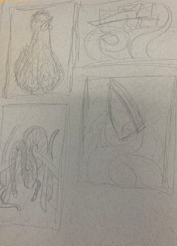
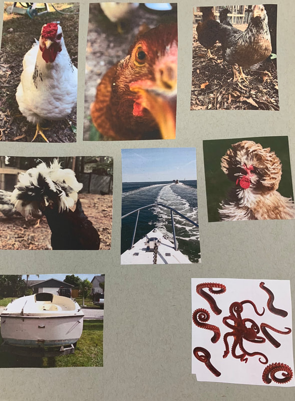
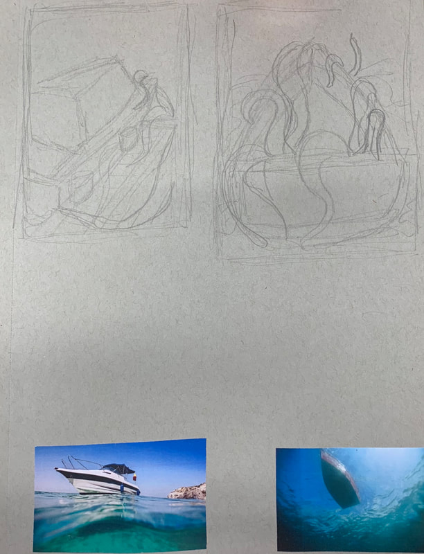
 These are my Look at That View compositional sketches and reference photos I was debating between drawing a chicken or a boat with tentacles, and decided to draw the boat with tentacles. The last picture is of my final sketch, where I began to plan my values.
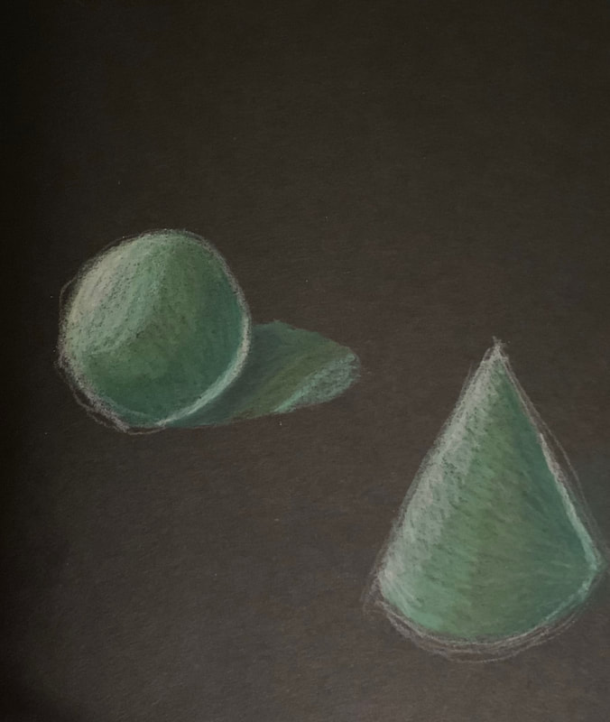
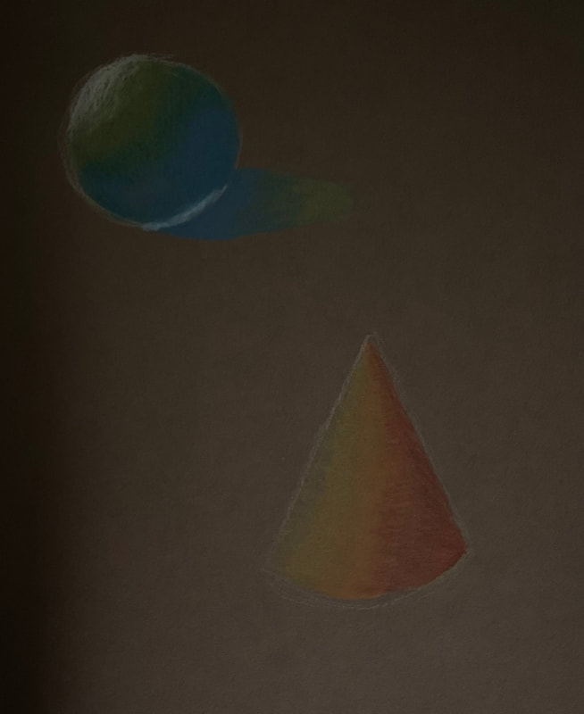
These are my practice shapes with Prisma colored pencils. They are on grey, black, and brown paper. I am finding colored pencils to be harder to work with and blend than drawing pencils. It is a much more complicated medium than what I am used to working with.
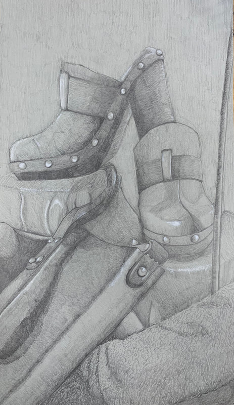
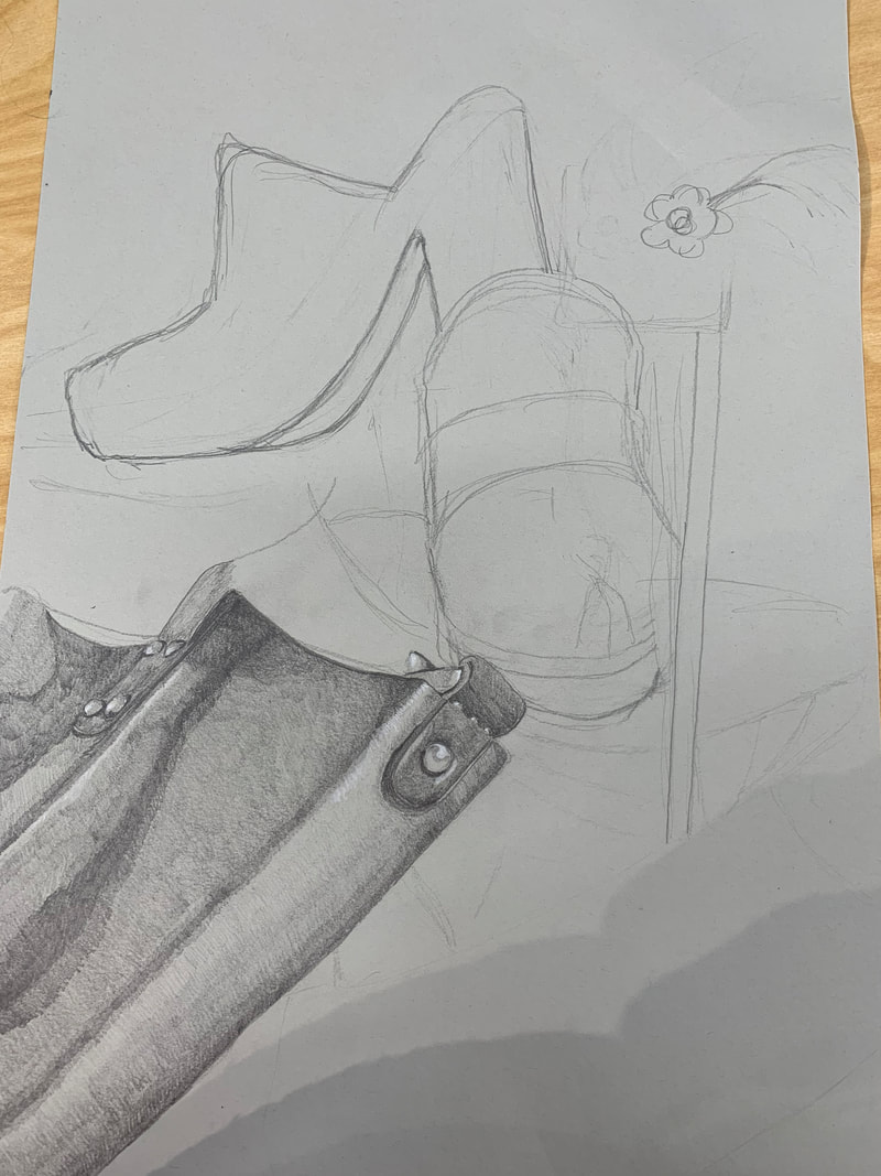
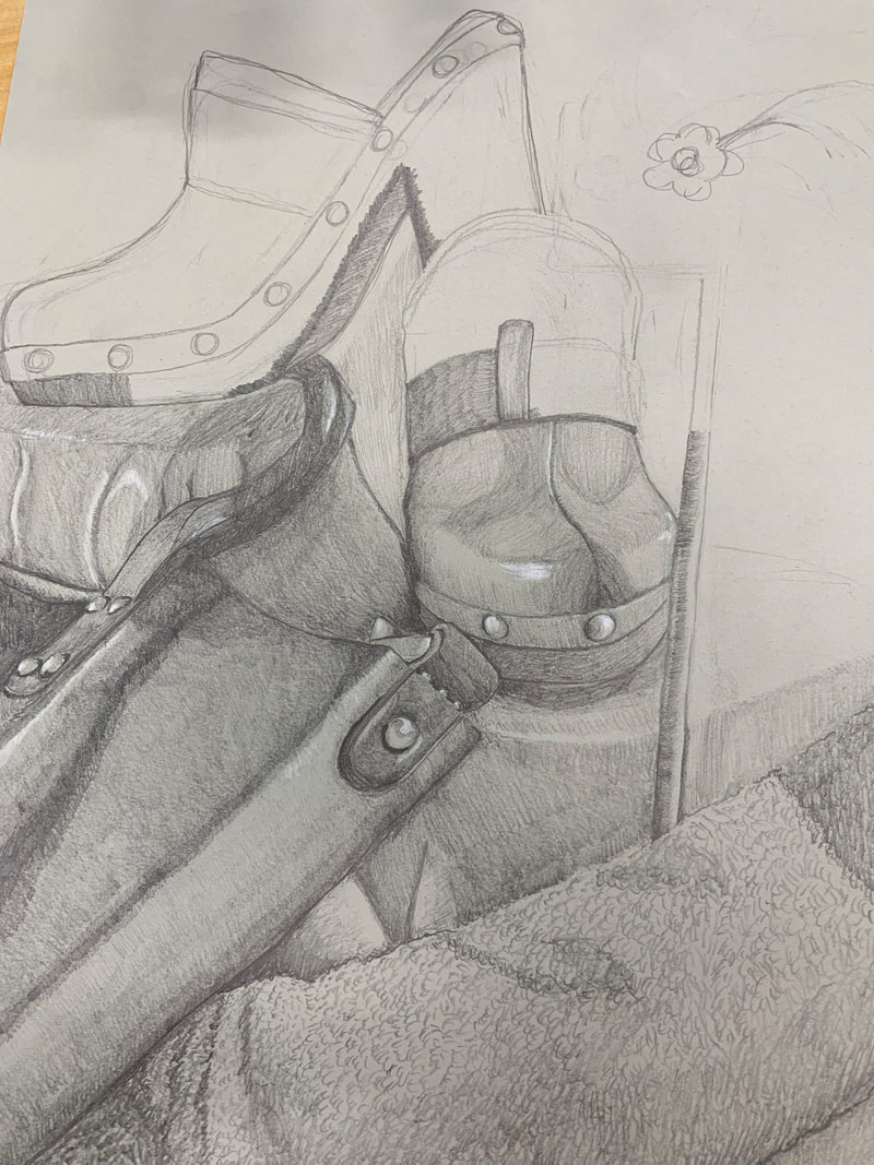
I think it is clear of what the objects in my drawing are and where they are in the space. My highlights are well blended and do not feel out of place.
I do believe that my shadows are realistic. I set my reference picture to a black and white filter to try and get as close as possible. I used a 4HB pencil for my darkest values and a white charcoal pencil for my brightest highlights.
I think my highlights and shadows stay consistent to a source of lighting coming from the upper left of the picture.
The compositional sketches where extremely important. They made it much easier to decide what exactly I would be drawing, instead of jumping in and realizing there was a better composition I could’ve done. I got to experiment with multiple angles and get an idea of what they’d look like before committing to one.
I think my use of highlights turned out very successful. I’m especially happy with how the metal studs on the bag and shoes turned out. I also think my range of values works well with the drawing.
I think for the most part my proportions and perspective are correct. I think it starts to feel a little bit wonky toward the top left of the piece with the second shoe, but overall is accurate to the subject.
I think this composition was the most pleasing out of all of my compositions that I originally considered for this piece.
I did end up having to cut my drawing because I knew I would not have enough time to add the pinwheel. I think I could work on giving myself enough time on parts of a drawing that I know will be more difficult rather than leaving those parts to do last.
I’ve learned a lot about shading and highlight while doing this project. I got to experiment with using things like white charcoal and 4HB pencils. This project also made me focus on working in very small areas and pay attention to small details instead of trying to get through the piece as quickly as possible. 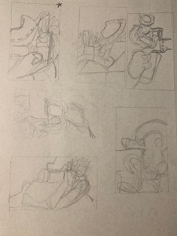 Here are my six compositional sketches. I made this by looking at the still life set up in class through the view finder and choosing six interesting angles to sketch. I ended up choosing the starred sketch in the top right. 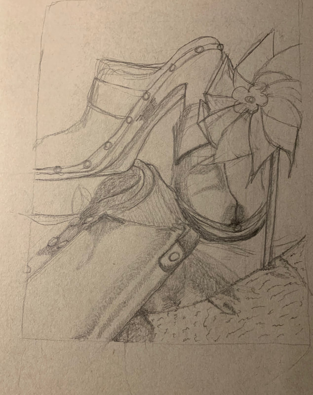 |
AuthorWrite something about yourself. No need to be fancy, just an overview. Archives
January 2020
Categories |


 RSS Feed
